Bubble News
Motivation
I, like a lot of college students I know, get an alarmingly large portion of my news from social media. This is not great for a few reasons:
- Transparency: It’s not clear why certain stories are recommended to me
- Importance: It’s difficult to quickly gauge the relative importance of different headlines
- Echo chamber: I’m probably getting shown articles based on my political leanings, leading to polarization
Sure, I could look at the front page of the New York Times and skim the most important stories of the day. But then I’m getting all of my news from one source. What about local news? What about specific niches I’m interested in like education policy or sports?
Bubble
Ben Silverman, Ian Layzer, John Graves, and I explored these questions as part of our final project for CSCI 0320: Introduction to Software Engineering. We built Bubble News to more transparently aggregate the most important news stories of the day (it may take a few seconds for the site to load!).
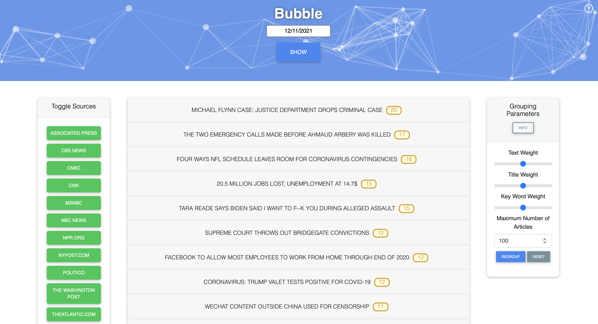
At a high level, Bubble scrapes thousands of articles across the web each hour and groups them into clusters (or “bubbles”) based on similarity. A few important notes:
- Similarity between articles is calculated using TFIDF on the title, text, and keywords (proper nouns extracted using NLP). This seems to work very well. For example, coronavirus quickly became the most important word in our corpus in early 2020.
- Headlines are ordered by the number of stories in that bubble. The underlying assumption is that if many articles are written about a story, it is a big deal. This helps with the importance problem above.
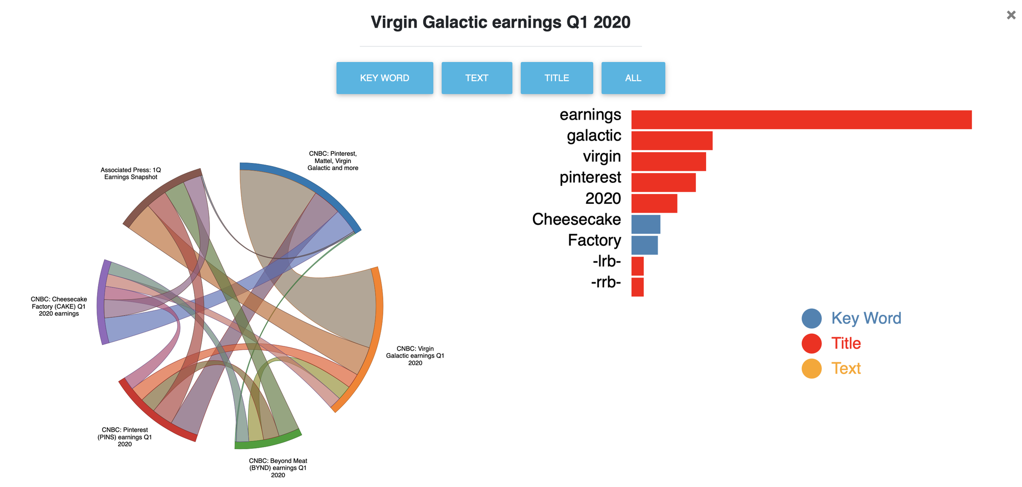
- The title of a bubble is simply the headline of the article in that bubble that is the most similar to every other article in the bubble. This can be bad when none of the headlines really describe what a bubble is about (see the image below).

- We built visualizations that explain why articles are grouped together. This helps with the transparency problem described above.
![]()
This is a visualization to explain the Q1 earnings bubble. On the right, we see that the most important word for this bubble is ‘earnings’, which makes sense based on the headlines. On the left, band thickness corresponds to similarity between a pair of articles. For example, we can see that the Cheesecake factory and Virgin Galactic articles are fairly unrelated. - The articles within a bubble often come from very different news sources, so you get multiple sides of the same story. This helps with the echo chamber problem described above.
To be very clear: Nobody should be getting their news from Bubble! In fact, you can’t because the site is no longer deployed (but if anyone has compute credits they want to donate to me then we can get this running again!). This project was mostly a prototype to explore what a more transparent and less polarized news aggregator could look like.